Please note: This website contains affiliate links. As an Amazon Associate, we earn from qualifying purchases at no additional cost to you.
.
Choosing colors for your home sounds like a fun weekend project—until you’re staring at eight nearly identical sage green swatches wondering how they can possibly all look the same and completely different.
The good news? You don’t need an art degree to pick a great palette.
Some color combos just work. They nail the balance of warm and cool, hit that sweet spot between subtle contrast and full-blown chaos, and instantly make a space feel more pulled together.
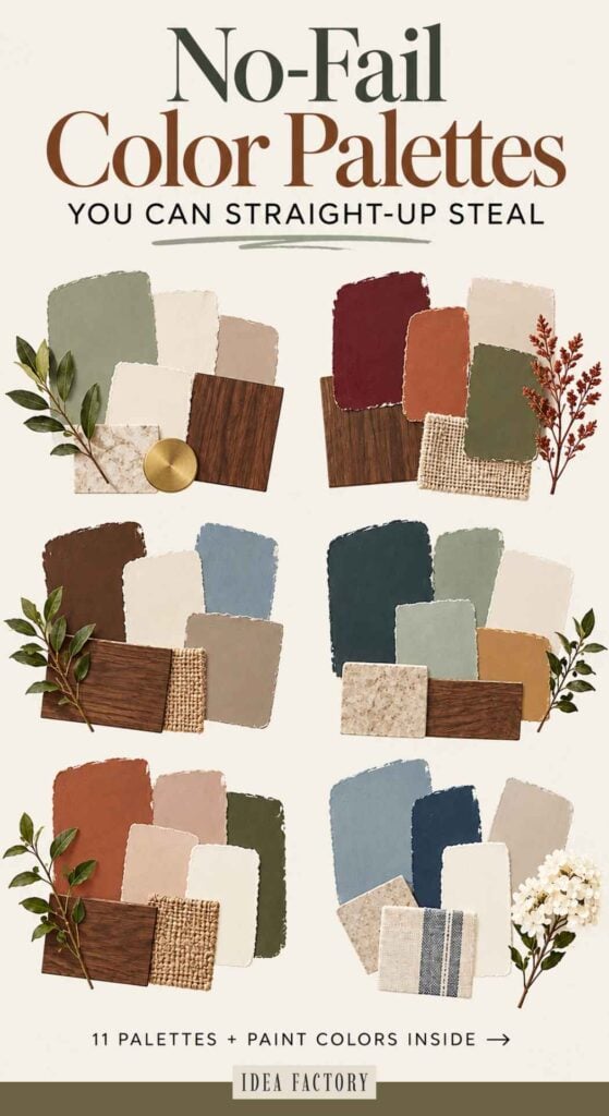
To save you from paint-swatch paralysis, we’ve rounded up some designer-approved home color schemes and color combinations—complete with real paint colors you can actually buy.
Just promise us one thing: test your favorites in the actual room first. Lighting is sneaky, and paint has a habit of looking completely different once it hits your walls.
12 Designer-Approved Room Color Schemes
If you’d like to jump to a specific color combo, just click here:
- Modern Organic Calm (Cream • Beige • Black • Olive)
- Moody Forest Green (Forest Green • Taupe • Black • Brass • Linen)
- Earthy Brown & Blue (Chocolate Brown • Dusty Blue • Warm Cream • Camel • Walnut)
- Cozy Autumn Neutral (Cream • Rust • Mustard • Warm Brown • Sage)
- High Contrast Classic (White • Black • Tan • Emerald)
- Soft Sage + Walnut (Sage Green • Warm Cream • Mushroom Taupe • Walnut • Aged Brass)
- Coastal Blues (Oatmeal • Sand • Slate Blue • Navy • Brass)
- Earthy Tones (Putty • Terracotta • Sage • Warm Gray • Cream)
- Neutral’s Never Boring (Greige • Ivory • Café Latte • Walnut • Champagne Gold)
- Desert Organic Boho (Peach Clay • Warm Sand • Dusty Rose • Soft White)
- Blue & Cream Classic (Navy • Cream • Walnut • Brushed Gold • Smoky Blue)
- Earthy Black & Tan (Tan • Black • Deep Charcoal • Linen)
Let’s dive into the palettes that never fail.
Modern Organic Calm
Cream • Warm Beige • Black • Olive • Natural Wood
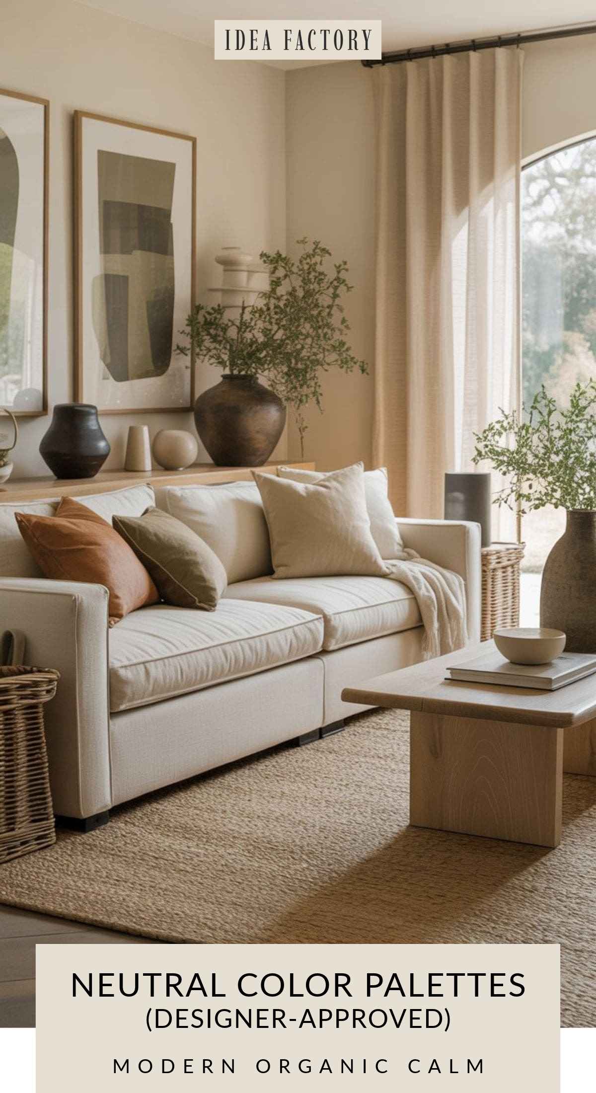
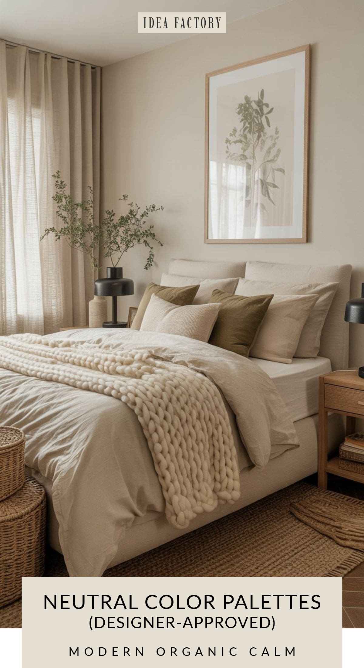
There’s a reason the modern organic look has stuck around. Cream and warm beige create a soft, easy backdrop while olive green and black give the room enough contrast to keep all those neutrals from disappearing into one big bowl of oatmeal.
Natural wood adds another layer of warmth and texture, making this color scheme especially easy to use in living rooms and bedrooms.
Modern Organic Calm Color Table
| Color Name | Recommended Paint Colors |
|---|---|
| Soft Cream | Benjamin Moore Swiss Coffee (OC-45) |
| Warm Beige | Sherwin-Williams Accessible Beige (SW 7036) |
| Black (Accent) | Sherwin-Williams Tricorn Black (SW 6258) |
| Olive Green | Benjamin Moore Southern Vine (2147-10) |
| Natural Wood | Behr Natural Maple (BIC-38) (wood-inspired tone) |
Works especially well with: modern organic, California casual, cozy minimalism, modern farmhouse and transitional interiors.This color scheme is perfect for bedrooms, living rooms – honestly, any room in your home. It also works really well with these home decor styles: modern organic
Organic Living Room Color Combo
Cozy Organic Neutral Color Combination
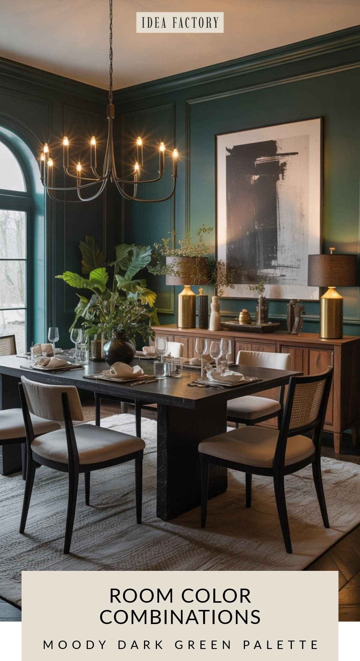
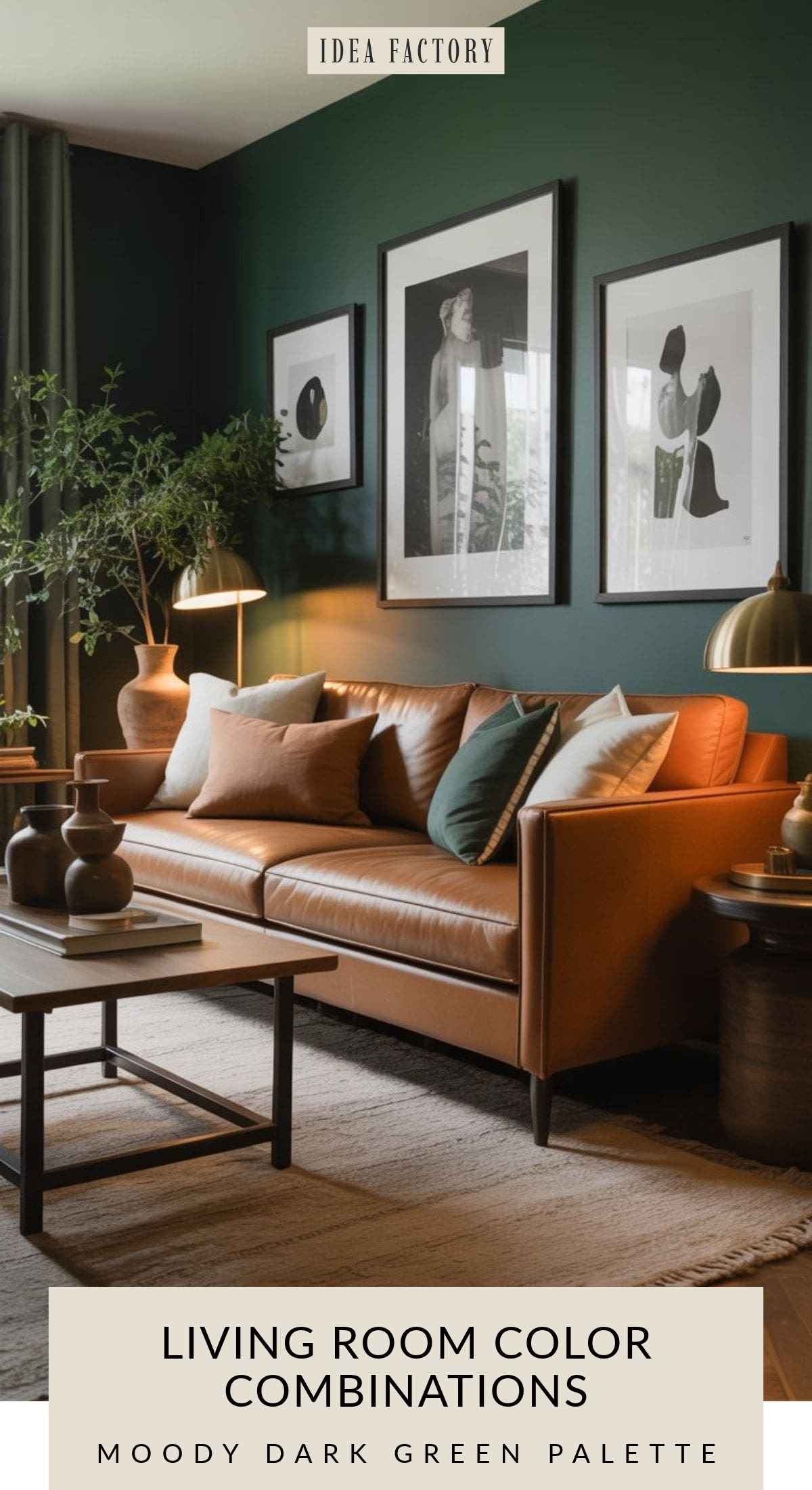
Moody Forest Green Retreat
Forest Green • Taupe • Black • Brass • Linen
If you want a room to feel cozy and dramatic without going all the way to black, dark forest green is hard to beat.
Taupe and natural linen lighten the palette, while black adds definition and brass brings in just enough warmth. The result feels rich and layered rather than dark for the sake of being dark.
Forest Green Color Scheme: Paint Colors to Try
| Color | Paint Color |
|---|---|
| Forest Green | Sherwin-Williams Forestwood (SW 7730) |
| Warm Taupe | Benjamin Moore Pashmina AF-100 |
| Soft White | Benjamin Moore Linen White 912 |
| Black Accent | Sherwin-Williams Tricorn Black SW 6258 |
Works especially well with: moody interiors, traditional and transitional rooms, organic modern spaces and cottage-inspired homes.
Moody Green Color Scheme for Dining Room
Dark Green Living Room Color Combination
A cozy moody living room with forest green walls, taupe sofa, black framed gallery wall, brass floor lamp, textured linen rug, warm wood accents, organic modern accessories, rich earthy textures, full-room composition.
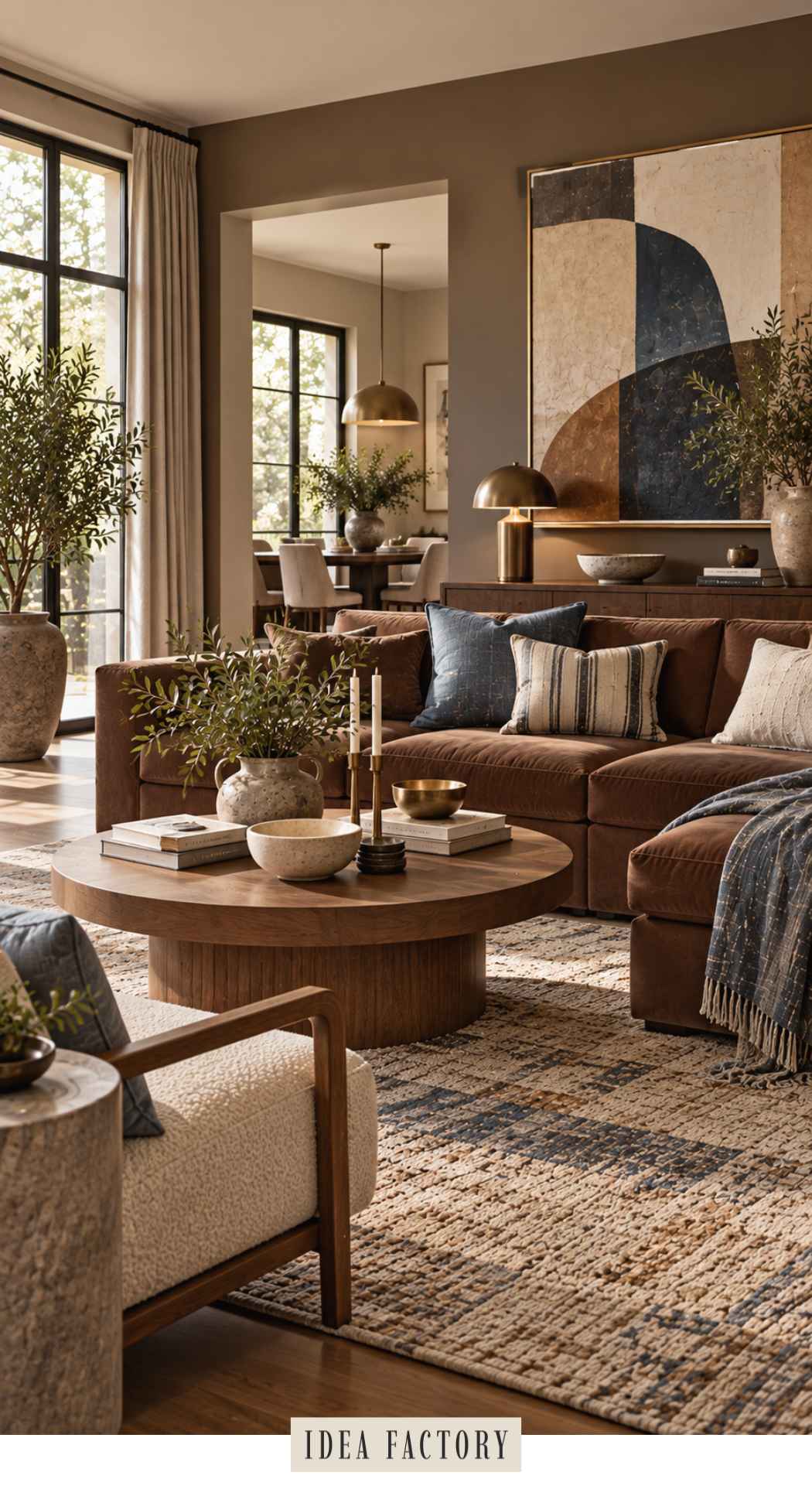
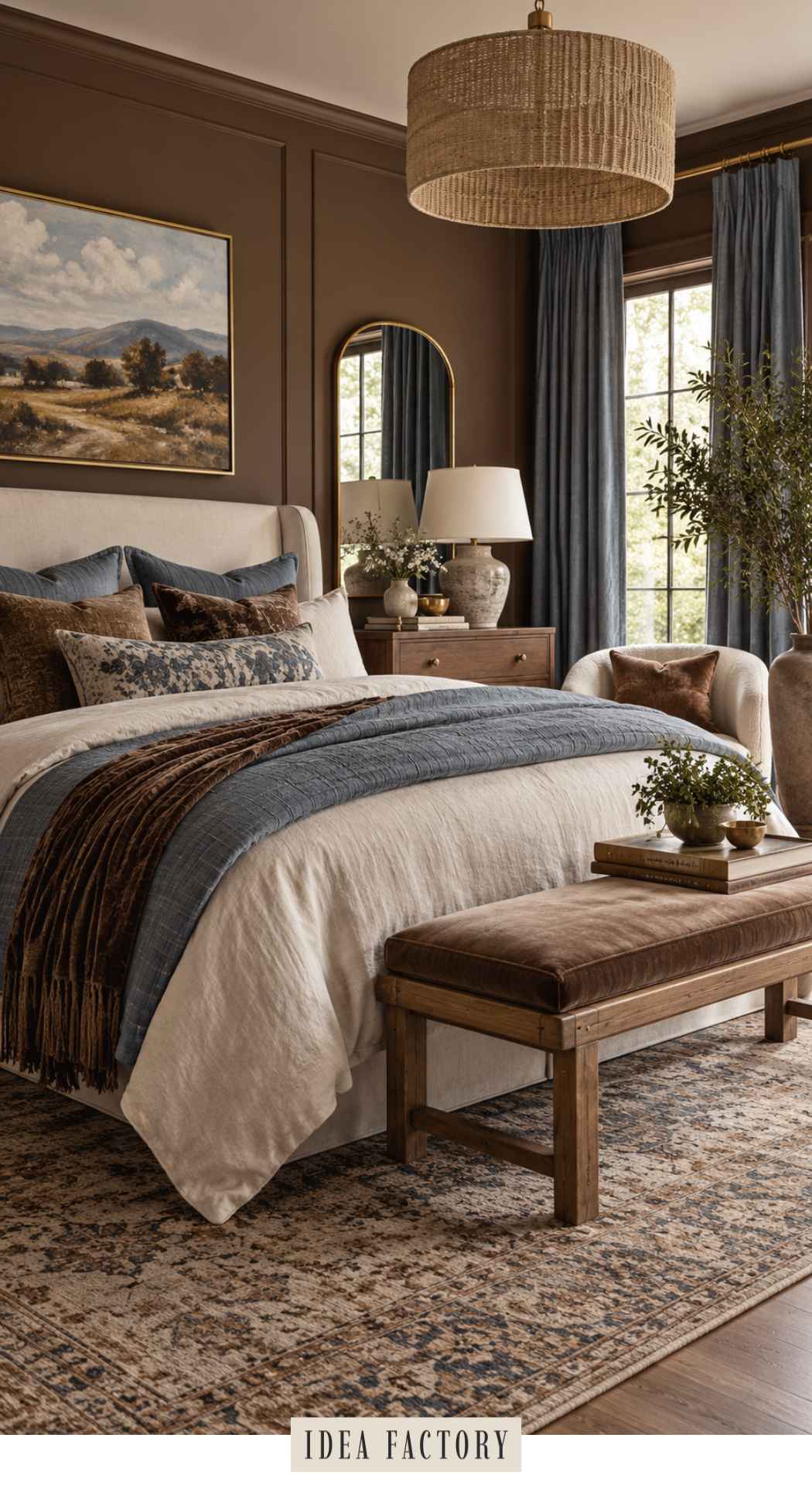
Chocolate Brown + Dusty Blue Color Schemes
Chocolate Brown • Dusty Blue • Warm Cream • Camel • Walnut
Brown is back in a big way—but this isn’t the heavy brown-on-brown look you may remember.
Pairing chocolate brown with dusty blue makes it feel completely different. Brown brings warmth and depth while muted blue adds a cooler note that keeps the palette fresh. Cream and camel bridge the two colors beautifully, and walnut reinforces the warm, collected feel.
Think cozy, sophisticated and just a little bit Nancy Meyers.
Brown + Dusty Blue Paint Colors to Try
| Color | Paint Color | Why It Works |
|---|---|---|
| Chocolate Brown | Benjamin Moore Appalachian Brown 2115-10 | Deep, earthy brown with enough softness to feel warm rather than almost-black |
| Bitter Chocolate | Sherwin Williams Bitter Chocolate SW 6013 | Deep, rich brown with slight purple undertones |
| Dusty Blue | Benjamin Moore Boothbay Gray HC-165 | Muted blue-gray that gives the brown a cooler, fresher counterpoint |
| Warm Cream | Benjamin Moore White Dove OC-17 | Soft warm white that lightens the palette without looking stark |
| Camel / Warm Tan | Sherwin-Williams Bungalow Beige SW 7511 | Adds that warm camel bridge between the cream and deeper brown |
| Walnut Accent | Natural walnut wood | Adds richness and reinforces the chocolate tones without introducing another paint color |
For walls, look for a rich brown with softened or earthy undertones rather than a harsh espresso shade. For the blue, a muted smoky or dusty blue works better here than a bright coastal blue.
Chocolate Brown Living Room with Dusty Blue Accents
Dusty Blue + Brown Bedroom
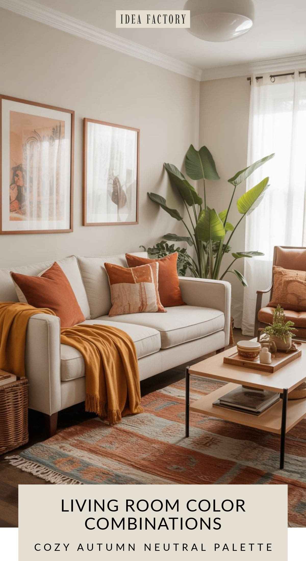
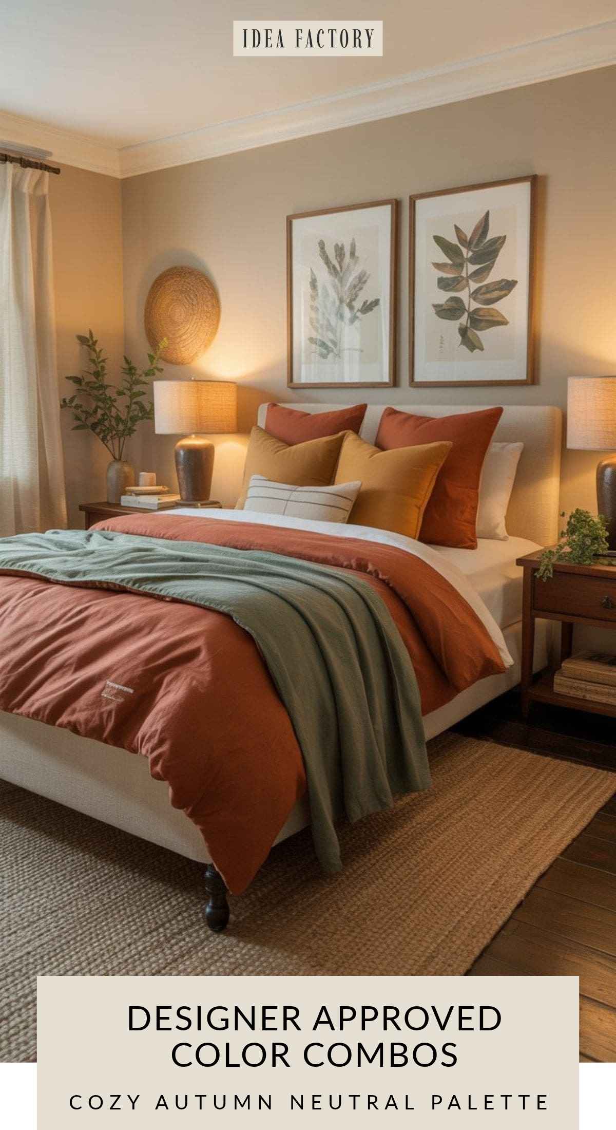
Cozy Autumn Neutral
Cream • Rust • Mustard • Warm Brown • Sage
Despite the name, this isn’t a palette that only works in Fall.
Rust, mustard and warm brown make a room feel instantly cozy, while sage introduces a cooler earthy note that keeps everything balanced. A generous amount of cream prevents the deeper colors from becoming overwhelming.
The easiest way to use this combination year-round is to keep the walls and larger furnishings relatively neutral and bring the richer shades in through textiles, artwork and smaller furniture.
Autumn Color Schemes: Paint Colors to Try
| Color | Paint Color |
|---|---|
| Soft Neutral | Benjamin Moore Pale Oak OC-20 |
| Rust | Behr Canyon Dusk (S210-4) |
| Sage Green | Sherwin-Williams Sage SW 2860 |
| Golden Accent | Sherwin-Williams Goldenrod or Golden Rule |
Works especially well with: boho, modern farmhouse, vintage-inspired and earthy interiors.
Earthy Autumn Living Room Color Palette
Rust, Sage + Mustard Color Palette for Bedroom
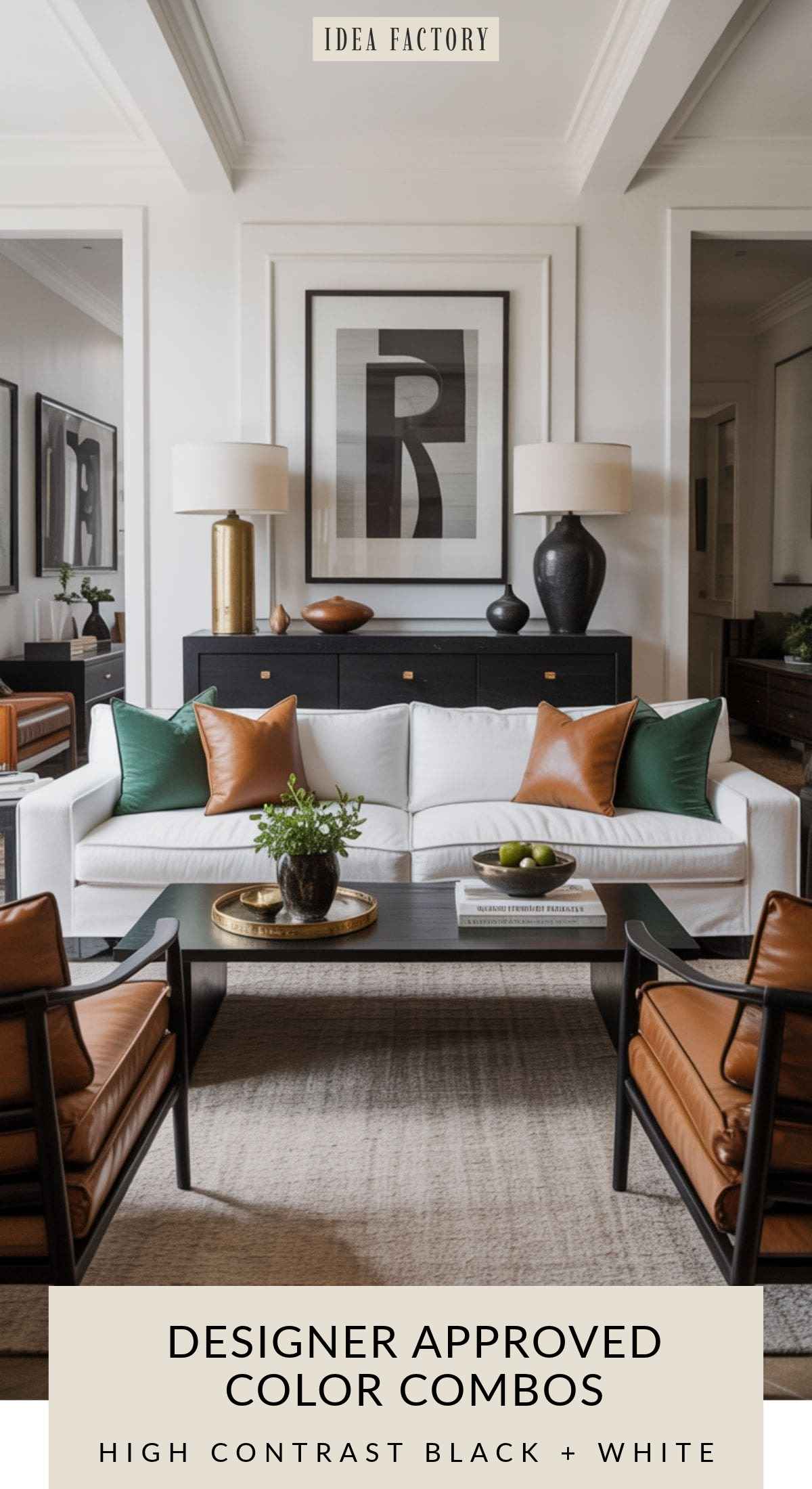
High-Contrast Classic | Room Color Combination
White • Black • Warm Wood • Tan • Emerald
This palette works because high-contrast combinations immediately create a designer look. Black and white create structure, while warm wood and tan soften the harshness. A pop of emerald is sophisticated and energizing without overwhelming the space. This palette is timeless — it’s been used in architecture, photography, and interiors for decades.
Classic High-Contrast Color Palette
| Color Name | Recommended Paint Colors |
|---|---|
| Bright White | Behr Ultra Pure White (1850) |
| Jet Black | Sherwin-Williams Tricorn Black (SW 6258) |
| Warm Wood | Behr Pecan Sandie (N250-4) |
| Soft Tan | Benjamin Moore Shaker Beige (HC-45) |
| Emerald Green | Sherwin-Williams Emerald City (SW 4530) |
Perfect for people who want that bold, crisp aethetic in your home. This includes modern and transitional spaces with that urban chic, contemporary feel.
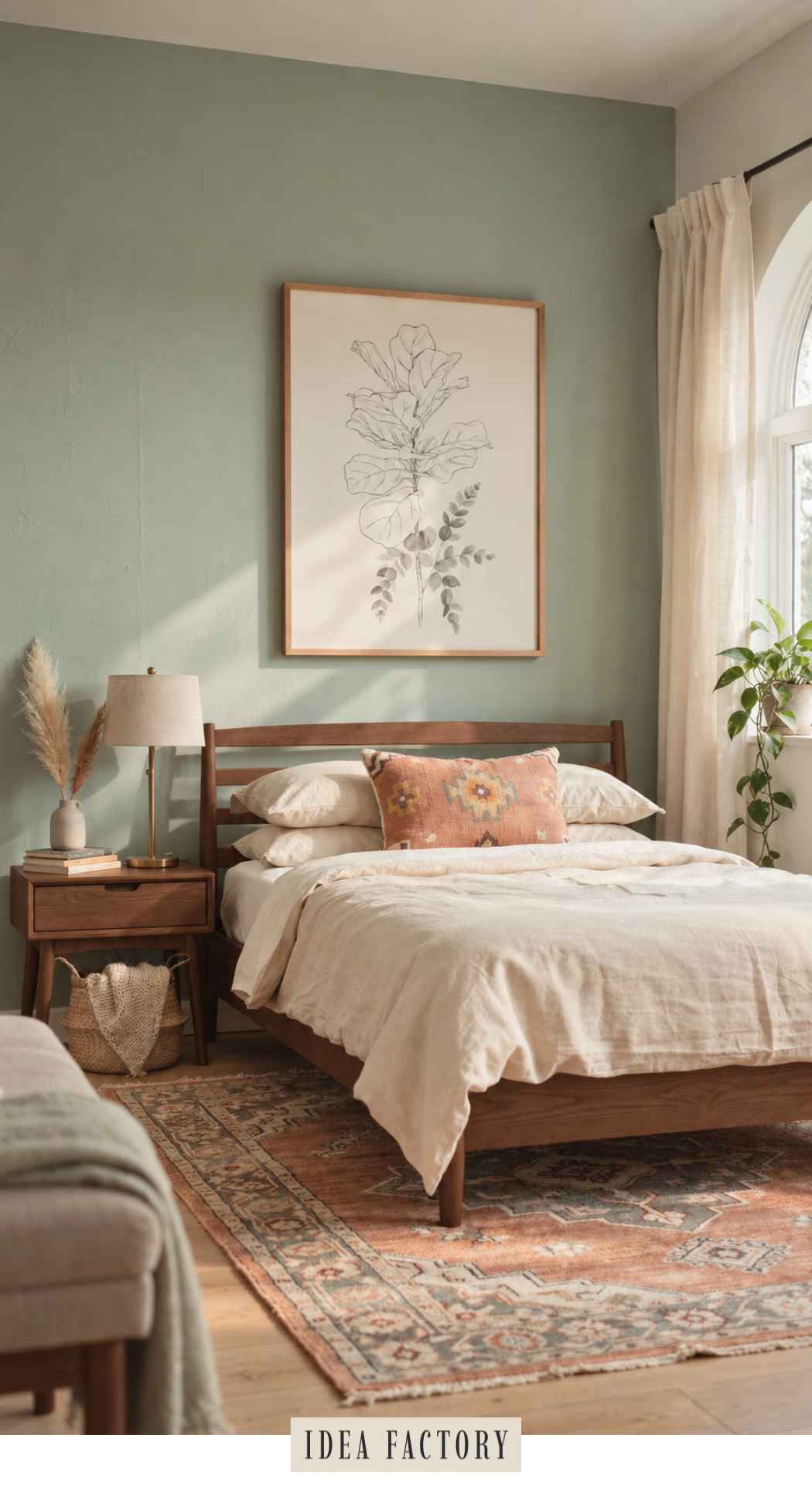
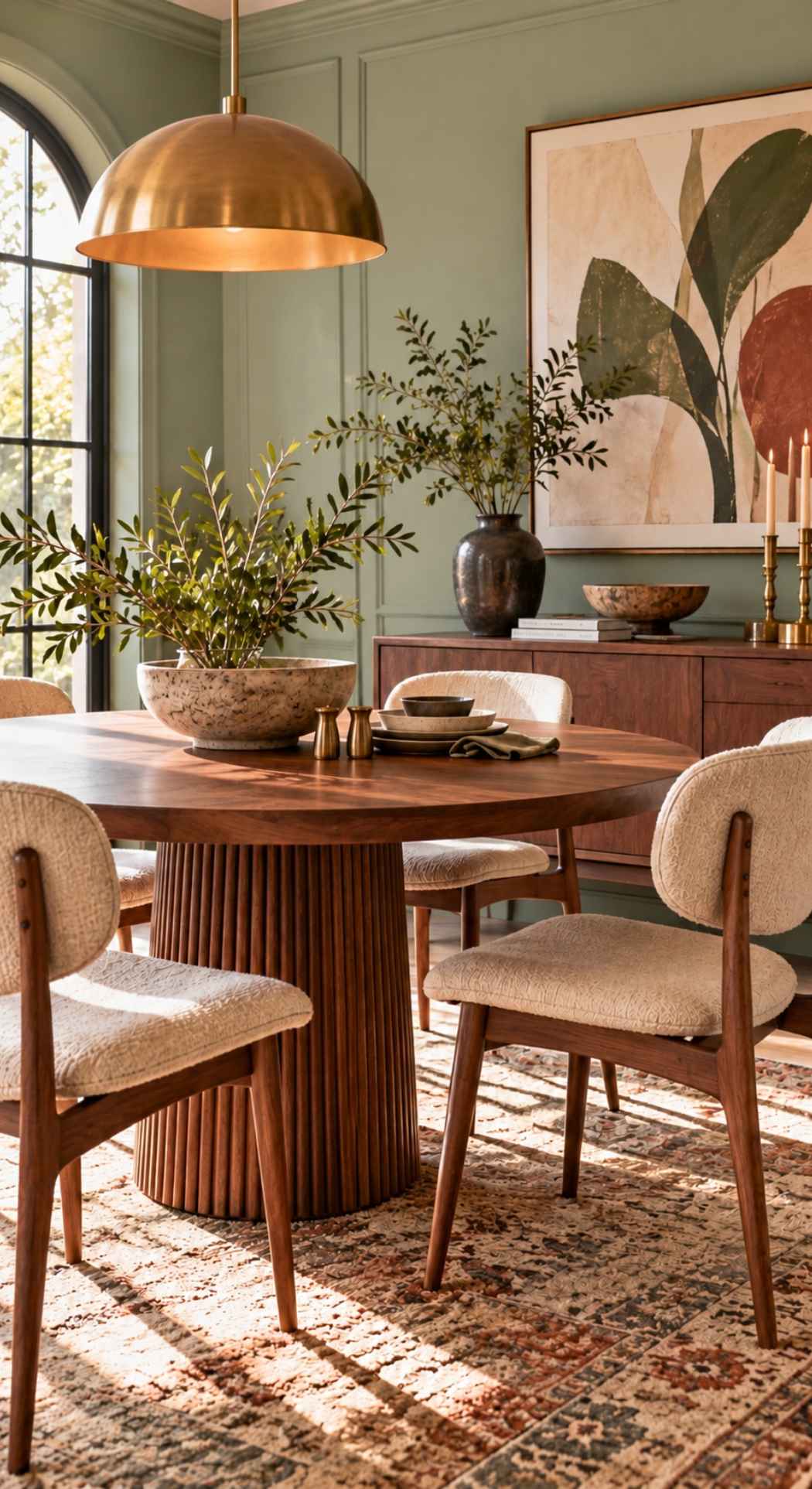
Soft Sage Green + Walnut
Sage Green • Warm Cream • Mushroom Taupe • Walnut • Aged Brass
Soft sage and walnut are one of those combinations that feel both fresh and timeless. The muted green brings a soft, calming quality to the room, while darker walnut adds warmth and enough contrast to keep the palette from feeling washed out.
Warm cream and mushroom taupe soften the transition between the two, while a little aged brass adds just enough warmth and polish. The result feels organic and relaxed, but more sophisticated than the typical sage-and-white combination.
Sage Green Paint Colors to Try
| Color | Paint Color | Best For |
|---|---|---|
| Soft Sage | Benjamin Moore October Mist 1495 | A muted, earthy sage with a sophisticated organic feel |
| Light Sage | Benjamin Moore Saybrook Sage HC-114 | A soft, slightly fresher green that works beautifully with walnut |
| Warm Sage | Sherwin-Williams Clary Sage SW 6178 | A warmer, earthier sage that brings out the richness of walnut |
| Soft Green-Gray | Sherwin-Williams Sea Salt SW 6204 | A lighter, airier option if you want the room to feel especially fresh |
| Warm Cream | Benjamin Moore White Dove OC-17 | A soft creamy white for trim, ceilings and adjoining spaces |
Finish the palette with: medium-to-dark walnut furniture, warm cream or ivory textiles, aged brass accents and a few earthy touches in terracotta, rust or muted clay.
Works especially well with: modern organic, transitional, contemporary, cozy minimalist and updated traditional interiors.
Soft Sage Green Bedroom
Sage Green Dining Room with Walnut Furniture
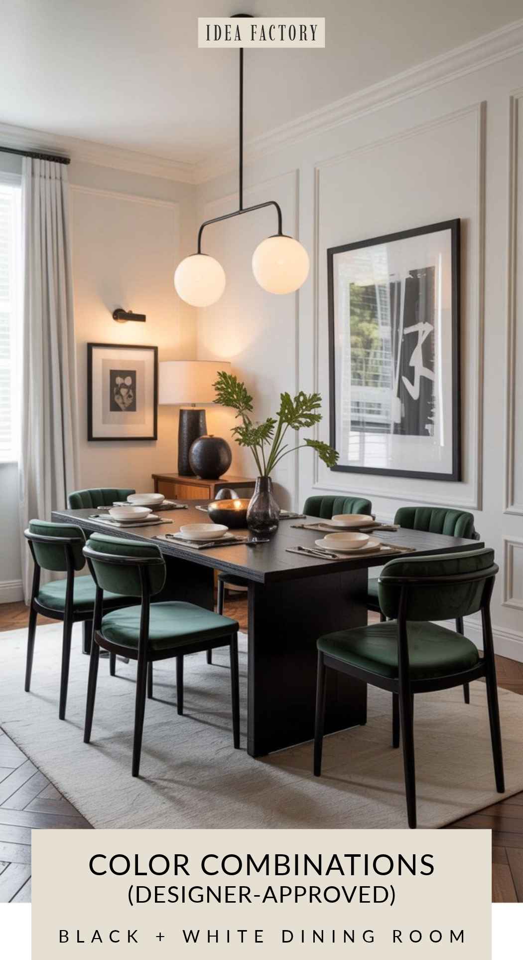
Black + Emerald High Contrast Color Combo
Dining Room Color Combination Example
Coastal But Make It Classy
Oatmeal • Sand • Slate Blue • Navy • Brass
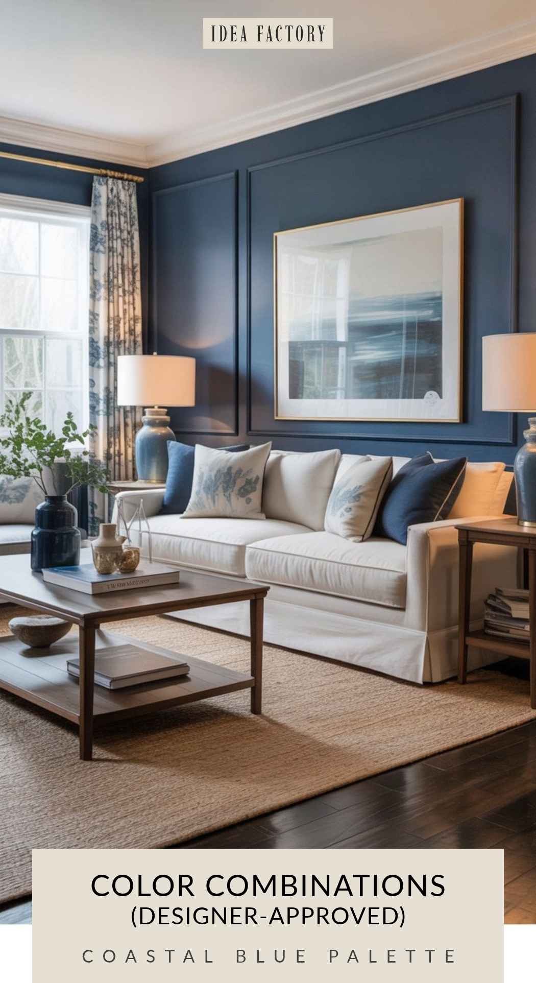
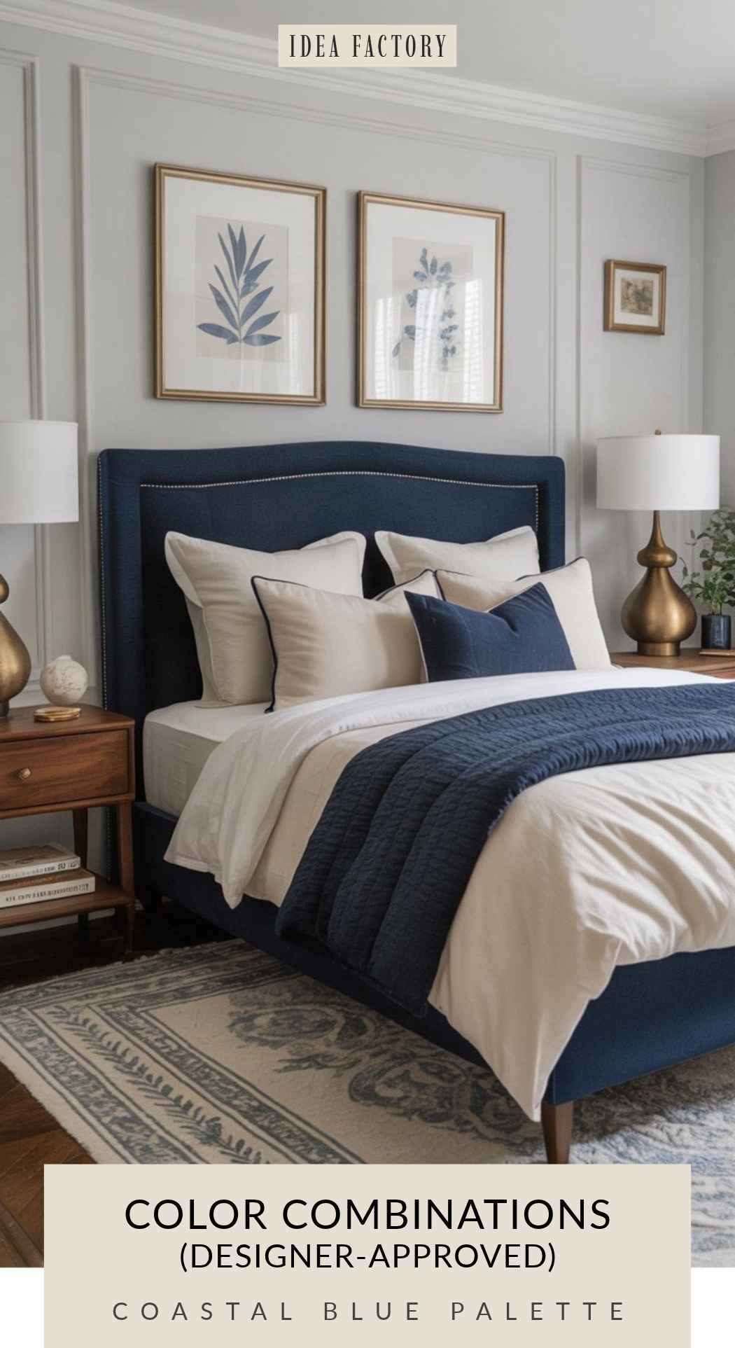
This palette works because it brings a calm coastal vibe without the kitsch. Sand and oatmeal create a soft backdrop, slate blue adds sophistication, and navy brings depth and structure. Brass keeps everything feeling elevated. It’s trendy in coastal regions but also timeless because the colors are grounded in nature.
Coastal Room Color Combinations
| Color Name | Recommended Paint Colors |
|---|---|
| Oatmeal | Benjamin Moore Wind’s Breath (OC-24) |
| Sand | Sherwin-Williams Accessible Beige (SW 7036) |
| Slate Blue | Behr Light French Gray (N520-1) |
| Deep Navy | Sherwin-Williams Naval (SW 6244) |
| Matte Brass | Sherwin-Williams Metallic Brushed Brass (SW 6685) |
Perfect for:
- Coastal
- Transitional
- Modern classic
- Light and airy interiors
- Homes craving serenity
Coastal Blue Color Combo for Living Room
Coastal Bedroom – Navy Blue Color Scheme
Earth-Toned Serenity
Putty • Terracotta • Sage • Warm Gray • Cream
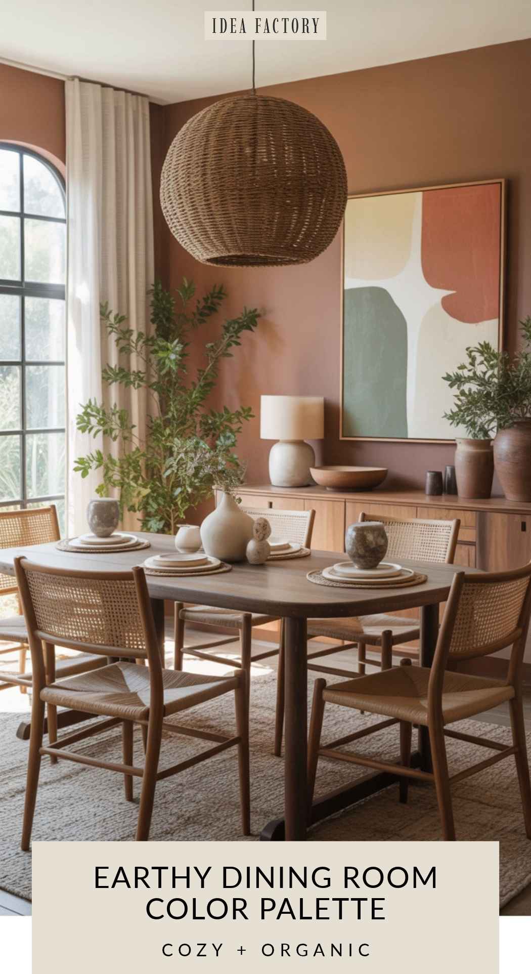
This palette works because it mirrors natural landscapes — terracotta earth, sage green foliage, putty stone, and warm gray shadows. Earth tones are known for creating emotional calm and grounded energy. This palette is a timeless staple for organic and nature-inspired interiors.
Earthy Home Color Combinations
| Color Name | Recommended Paint Colors |
|---|---|
| Putty | Behr Putty (N240-2) |
| Terracotta | Sherwin-Williams Cavern Clay (SW 7701) |
| Muted Sage | Sherwin-Williams Svelte Sage (SW 6164) |
| Warm Gray | Benjamin Moore Revere Pewter (HC-172) |
| Cream | Benjamin Moore Navajo White (OC-95) |
Works best for: Organic modern spaces, from boho to cottage / farmhouse style.
Terracotta and Sage Green Color Palette
Earthy Color Palette for Dining Room
Neutral Beige… With a Touch of Glam
Greige • Ivory • Café Latte • Dark Walnut • Champagne Gold
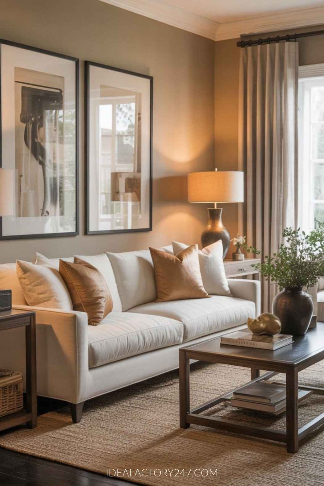
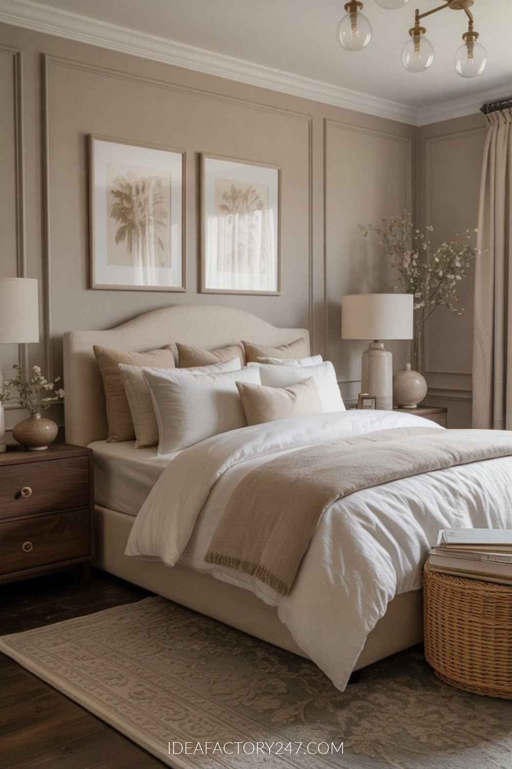
This palette works because it’s warm, soft, and universally flattering — the interior design equivalent of good lighting. Greige walls create a quiet, elegant backdrop. Café latte tones add warmth, dark walnut adds depth, and champagne gold gives the whole room a subtle glow. It’s on-trend right now, but rooted in timeless neutrals that won’t age poorly.
Neutral Girl Era — Room Color Combinations
| Color Name | Recommended Paint Colors |
|---|---|
| Greige | Benjamin Moore Classic Gray (OC-23) |
| Ivory | Sherwin-Williams Alabaster (SW 7008) |
| Café Latte | Behr Toasty Gray (N320-2) |
| Dark Walnut | Sherwin-Williams French Roast (SW 6069) |
| Champagne Gold | Behr Champagne Gold Metallic |
Perfect for:
- Modern organic
- Transitional
- Cozy minimalism
- Influencer-style interiors
- Homes aiming for soft luxury
Neutral Living Room with Dark Walnut Accents
Cozy Neutral Bedroom Color Palette
Soft Desert Sunset
Peach Clay • Warm Sand • Dusty Rose • Soft White • Weathered Wood
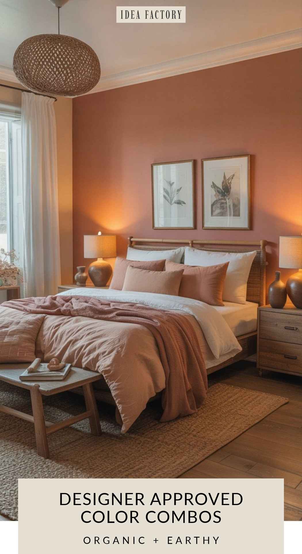
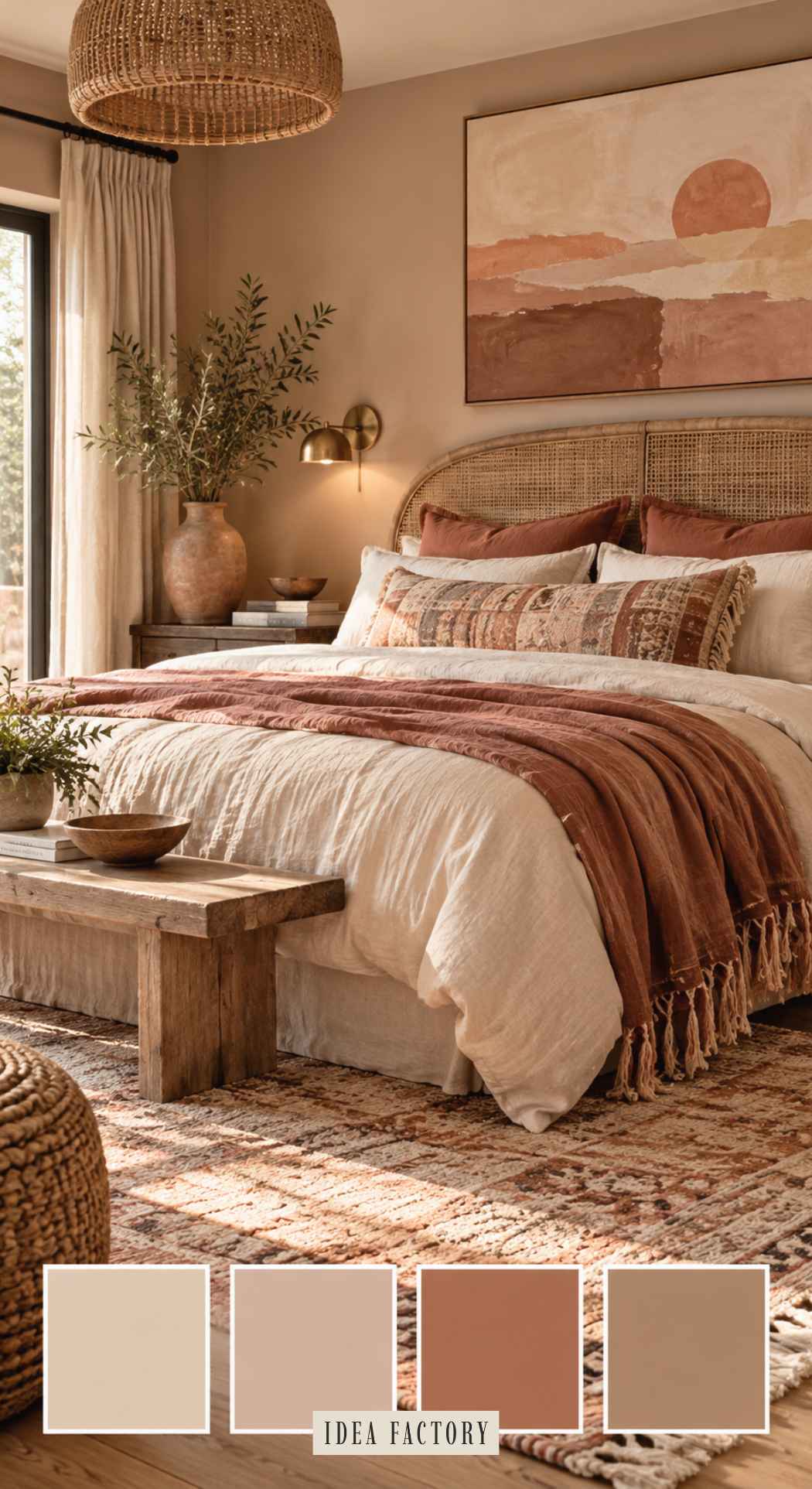
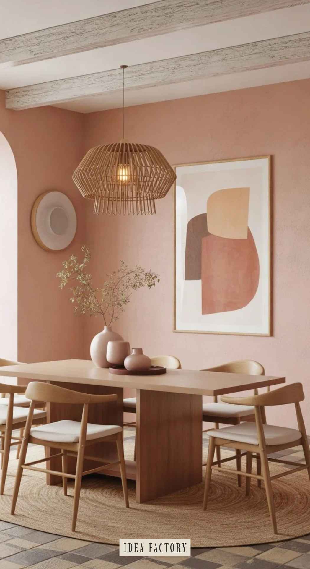
This palette works beautifully because it blends warm, muted tones that mimic natural sunsets — soft but not overly feminine. Peach clay and dusty rose bring warmth without being overwhelming, while warm sand and soft white keep everything grounded and calm. Weathered wood adds earthy contrast so the palette doesn’t feel washed out.
This combination is trending in 2026 as “soft desert,” but its muted nature makes it timeless, especially in cozy or boho-inspired interiors.
Organic Boho Home Color Combinations
| Color Name | Recommended Paint Colors |
|---|---|
| Peach Clay | Sherwin-Williams Nomadic Desert |
| Warm Sand | Behr Sand Motif (780C-3) |
| Dusty Rose | Benjamin Moore Rosetta |
| Soft White | Benjamin Moore White Dove (OC-17) |
| Weathered Wood | Behr Aged Beige (PPU7-09) |
Perfect for:
- Minimal boho
- Modern organic
- Eclectic vintage
- Soft coastal
- Small bedrooms needing warmth without heaviness
Boho Bedroom Color Scheme Example
Dusty Rose and Peach Clay Color Scheme Example
Blue & Cream Modern Classic Color Scheme
Navy • Soft Cream • Walnut • Brushed Gold • Smoky Blue
Blue and cream is one of those color combinations that’s almost impossible to mess up.
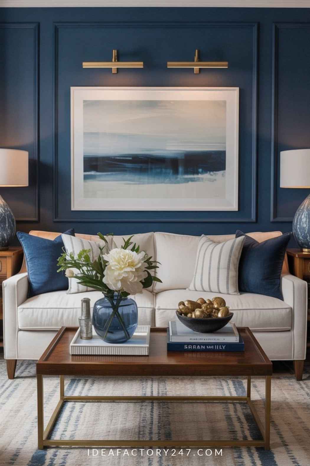
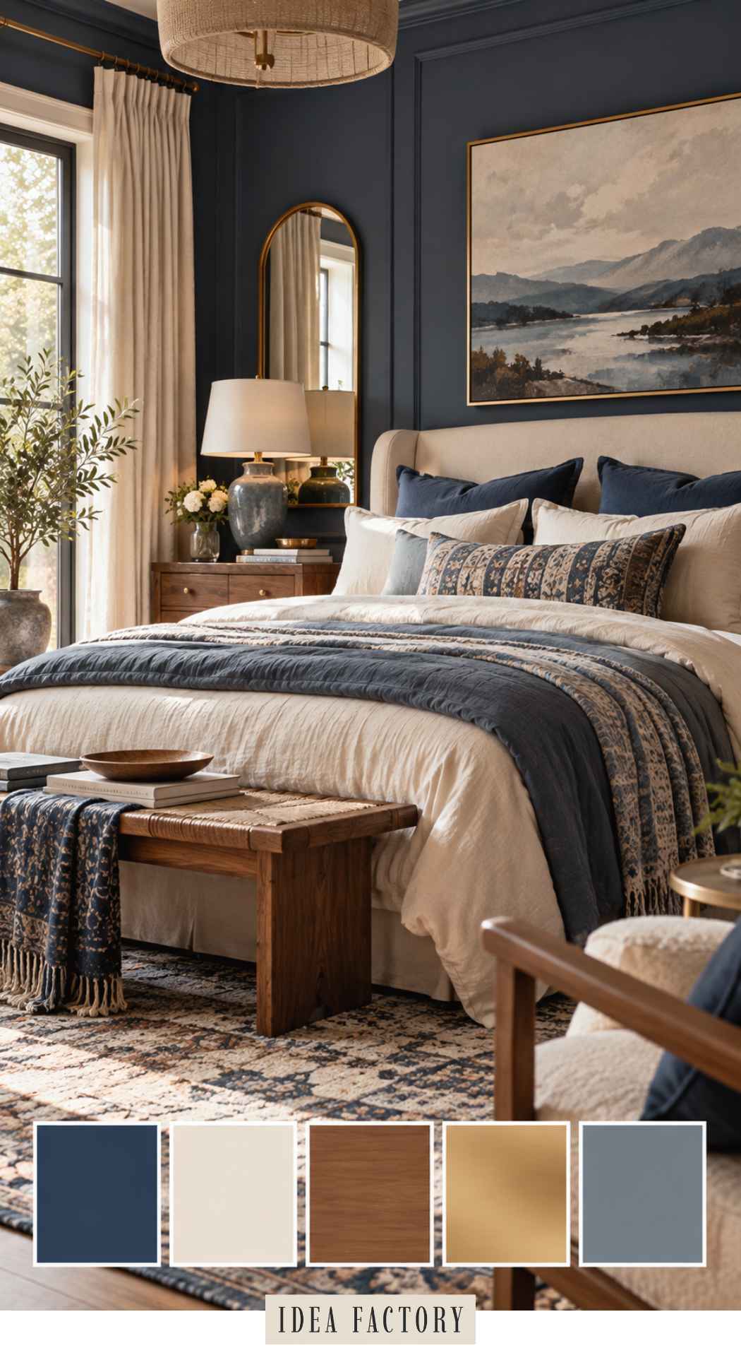
Navy provides the structure, smoky blue softens it, and cream keeps the room bright. Walnut and warm metallic accents prevent the blues from feeling cold. It’s an especially good choice if you like traditional interiors but want them to feel fresher and more relaxed.
Blue Room Color Combinations: Paint Colors to Try
| Color | Paint Color |
|---|---|
| Navy | Sherwin-Williams Naval (SW 6244) |
| Smoky Blue | Sherwin-Williams Smoky Blue (SW 7604) |
| Warm Cream | Benjamin Moore White Dove OC-17 |
| Soft Cream | Behr Creamy Mushroom (PPU5-13) |
| Rich Brown | Benjamin Moore Brown Sugar (2112-20) |
On a personal note, I’ve always been drawn to this color combo. I even painted my house Naval (Sherwin Williams) and am about to paint the dining room Smoky Blue!
This color scheme works especially well with: modern classic, transitional, coastal, traditional and updated grandmillennial interiors.
Smoky Blue, Navy and Cream Living Room Color Combo
Blue Bedroom Color Scheme
Modern Earthy Black + Tan
Tan • Black • Charcoal • Light Linen • Natural Wood
Black doesn’t have to make a room feel stark.
Pair it with tan, linen and natural wood and it becomes much warmer and more approachable. Deep charcoal gives you another dark tone to layer in without making everything perfectly black-and-white.
This is also one of the easiest palettes to adapt. Add woven textures and it can lean boho. Keep the lines clean and it becomes modern. Add vintage pieces and aged wood and it moves toward modern farmhouse.
Modern Earthy Black + Tan — Color Combination Table
| Color | Paint Color |
|---|---|
| Warm Tan | Benjamin Moore Manchester Tan HC-81 |
| Black | Sherwin-Williams Tricorn Black SW 6258 |
| Charcoal | Behr Cracked Pepper PPU18-01 |
| Light Linen | Benjamin Moore Linen White 912 |
| Natural Wood | Behr Wheat Bread (720C-3) |
Perfect for:
- Modern farmhouse
- Scandi modern
- Minimalist
- Urban lofts
- Neutral-lovers who want sophistication
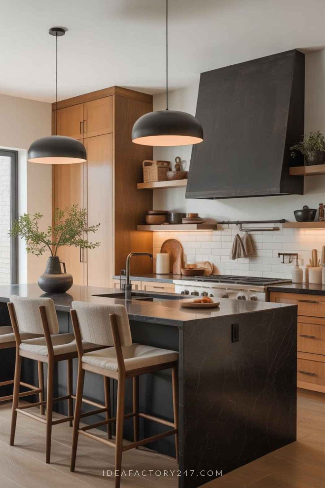
Modern Kitchen Color Combination
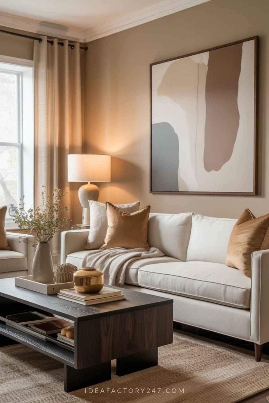
Black + Tan (or Beige) Living Room Color Combo
How to Choose the Right Color Scheme for Your Home
If several of these palettes are calling your name, don’t worry about choosing one exact formula for your entire house.
Instead, look for the colors that keep showing up in the rooms you save.
If nearly everything you love includes warm cream, olive green and wood, that’s probably a better clue than whatever happens to be labeled the color of the year.
A few things can make choosing easier:
- Start with colors you can’t easily change, such as flooring, countertops, tile and large furniture.
- Pay attention to undertones. Two colors can look perfect online and fight with each other once they’re in the same room.
- Consider the natural light in your space. A paint color that looks warm and creamy in one room can look considerably cooler in another.
- Test paint colors before committing to an entire room.
Always – ALWAYS! – Test Your Paint Colors First
Paint swatches on a screen are great for narrowing down your options, but they’re not a reliable way to predict exactly how a color will look in your home.
Lighting changes throughout the day, and surrounding colors—from your floors to your furniture—can completely change how a paint color reads. That’s why we recommend testing your finalists on the actual wall before buying gallons of paint.
Try the large peel-and-stick paint samples from Samplize →
Move the sample around the room and look at it in morning light, afternoon light and after dark. It’s a much easier way to spot an undertone you don’t love before you’ve painted four walls with it.
What Colors Are Trending for 2027?
If the early 2027 color forecasts are any indication, we’re moving toward homes that feel warmer, earthier and a whole lot more personal.
Sherwin-Williams’ 2027 Colormix Forecast, Rewild, includes 48 colors built around three design stories: Revive, Reignite and Reconnect. The collection mixes grounded, nature-inspired shades with richer, more expressive colors—including greens, browns, warm neutrals and unexpected combinations designed to be layered together.
That’s good news if you’re already drawn to some of the palettes above. Soft greens, deep chocolate browns, warm wood tones and richer accent colors aren’t disappearing anytime soon.
One of our favorites from the forecast is Taiga SW 9654, a sophisticated green Sherwin-Williams features in its Reignite collection. Bitter Chocolate SW 6013 also appears prominently in the forecast, reinforcing the shift toward those warm, cocooning browns we’ve been seeing everywhere.
We’ll continue updating this guide as more 2027 color forecasts are released—and showing you ways to use the trends without redecorating your entire house every January.
Explore the Sherwin-Williams 2027 Colormix Forecast
Final Thoughts
The best home color schemes aren’t necessarily the ones with the most colors—or the ones everyone happens to be talking about this year.
They’re the combinations that give you a balance of light and dark, warm and cool, quiet and interesting.
Start with a palette you love, use it as a guide rather than a strict formula, and then adjust the proportions until it feels right in your space.
And before you fall completely in love with that perfect paint color online, sample it at home. Your walls—and possibly your sanity—will thank you.
Please note: This website contains affiliate links. As an Amazon Associate, we earn from qualifying purchases at no additional cost to you.
.